The Topps Company · 2017
Topps Apps
Designed screens and components across Topps' eight card-collecting apps, including a redesign of the My Cards filters.
- Role
- User Interface Designer
- Studio
- The Topps Company
- Years
- Jul 2017 – Nov 2017
- Platforms
- iOS · Android
- Apps
- 8 card-collecting apps incl. Kick
The job
Topps publishes eight card-collecting apps on iOS and Android, with quests and gameplay alongside collecting. I worked on all of them, designing and helping build screens and components.
Highlights
- First-time tooltips. A dimmed overlay that walks new players through the most important features.
- 2018 base card templates for Kick, Huddle and Skate. Each template sets the look for the year’s cards, and designers fill in the details to generate each card.
- Team colors. After players pick a favorite team, the whole app takes on that team’s colors.
- A new side menu. The menu used to appear as an overlay. I changed it to push in from the side of the screen, where players can drag it open and closed.
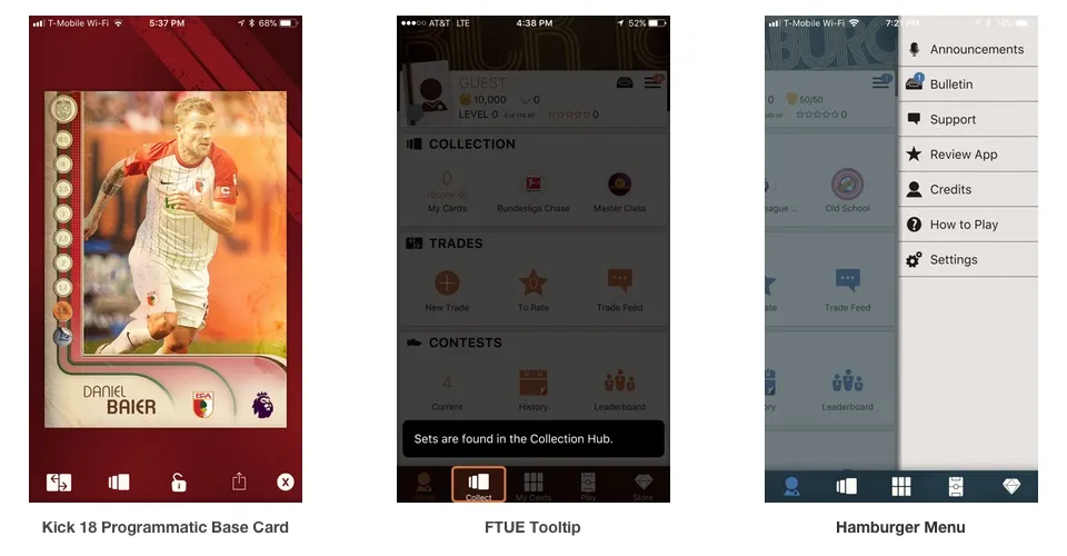 Screens and components from the Topps apps.
Redesigning the My Cards filters
Filtering your cards used to open an options panel that filled the whole screen, even though none of the options reached past the halfway point.
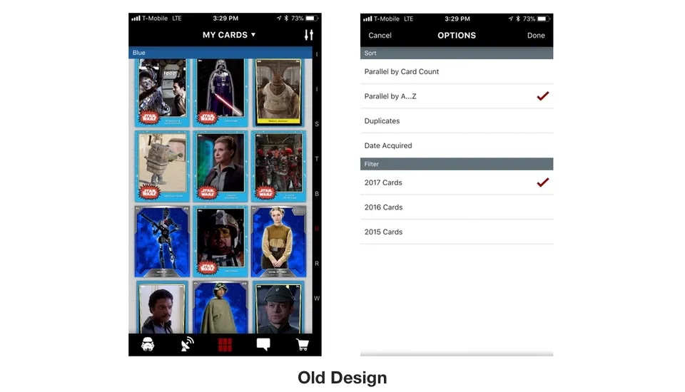 Before: the filter panel covered the whole screen.
In my design the panel slides in from the right and takes up half the screen. The My Cards screen moves over and dims, so players can still see what they are filtering, and the collection refreshes as they pick options. Players can tap the icon to open the panel and tap outside it to close, or swipe in from the right edge. That matches how the side menu on the home screen works.
The old panel marked selections only with a check mark. Some categories allow one choice and others allow any number, and players couldn’t tell which without trying. My design uses radio buttons for single choices and checkboxes for multiple choices.
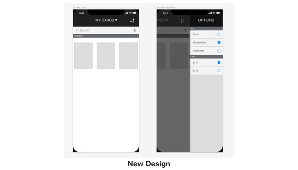 After: a half-width panel with radio buttons and checkboxes.